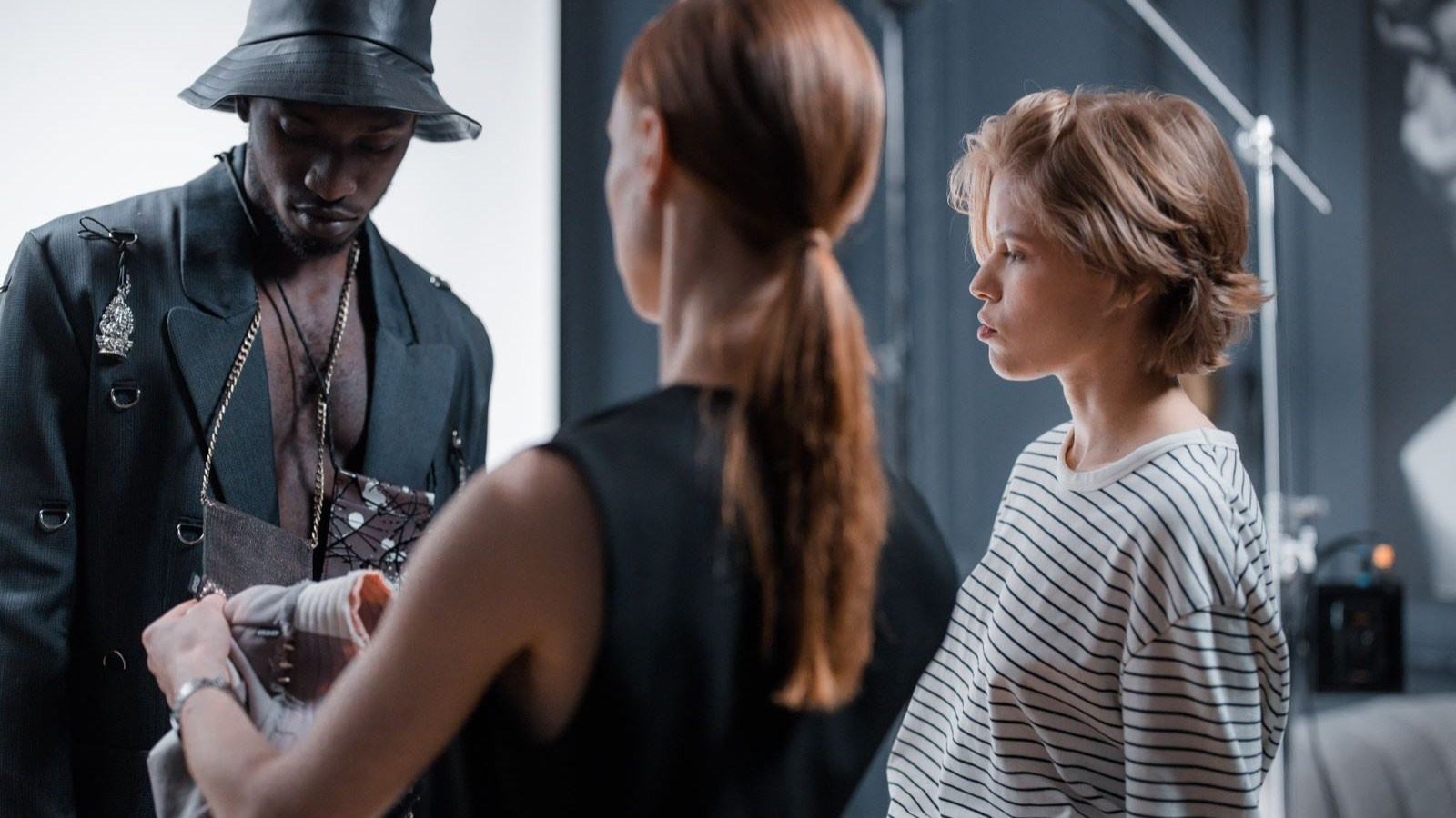
Accurate colour is one of the most important requirements in fashion ecommerce photography. A customer cannot touch the fabric or compare the garment with a physical sample, so the image becomes the main reference for colour, finish and material.
Colour accuracy does not mean making every screen display an identical result. Consumer devices, brightness settings and ambient light vary. The production goal is to create a controlled, consistent and correctly prepared source image that gives the garment the best chance of being represented honestly.
This guide explains how fashion brands in Dubai and across the UAE can manage colour from sample preparation and lighting through retouching, approval and final ecommerce delivery.
The Short Answer
Accurate fashion colour depends on the physical sample, controlled lighting, appropriate camera settings, calibrated monitoring, a consistent colour workflow and restrained retouching. Every colour variation should be verified, and the final files should be reviewed in the intended ecommerce environment.
The objective is not to make a garment look more saturated or attractive than it is. It is to represent the approved product clearly and consistently while preserving fabric texture and detail.
What You Will Learn
- Why inaccurate colour affects customer trust
- Where colour differences enter the production workflow
- How lighting and exposure influence garments
- How brands should approve colour variations
- What photography can and cannot control
Why Colour Accuracy Matters Commercially
Fashion customers often compare several garments, colours and brands quickly. If a navy dress appears black, a warm beige appears grey or a red garment looks different between catalogue angles, the product page becomes harder to trust.
Inaccurate colour can create:
- Misunderstood product expectations
- Inconsistent catalogue pages
- More customer questions
- Extra retouching and approval cycles
- Reshoots when variants cannot be matched
- Content that conflicts with physical retail displays
Colour is also part of brand presentation. A collection photographed across several days should still feel like one coordinated launch rather than unrelated batches.
Start With the Correct Physical Sample
The camera can only record the sample placed in front of it.
Production samples may differ from final stock because of dye lots, fabric substitutions, washing, finishing or storage. Before the shoot, the brand should confirm that each garment is the approved selling version.
Label every colour variation with its correct SKU and commercial colour name. Avoid relying on names such as sand, stone, burgundy or sage without a physical reference, because different teams may interpret them differently.
If several samples of the same colour exist, compare them before production and identify the approved reference. The photographer should not be expected to decide which variation is commercially correct.
Fabric Preparation Affects Colour
Creases, lint, pressure marks and uneven steaming change the way light travels across a fabric.
A dark garment covered with fine dust may appear grey. Crushed velvet changes brightness as the pile direction changes. Satin can show a bright highlight beside a much darker area even though both are the same material.
Prepare garments consistently:
- Steam according to the fabric requirements
- Remove lint and loose fibres
- Check pile or nap direction
- Align panels, sleeves and hems
- Use the correct lining and undergarments
- Protect clean samples between looks
Good preparation reduces the need to correct uneven colour that is actually caused by texture or handling.
Lighting Quality and Colour
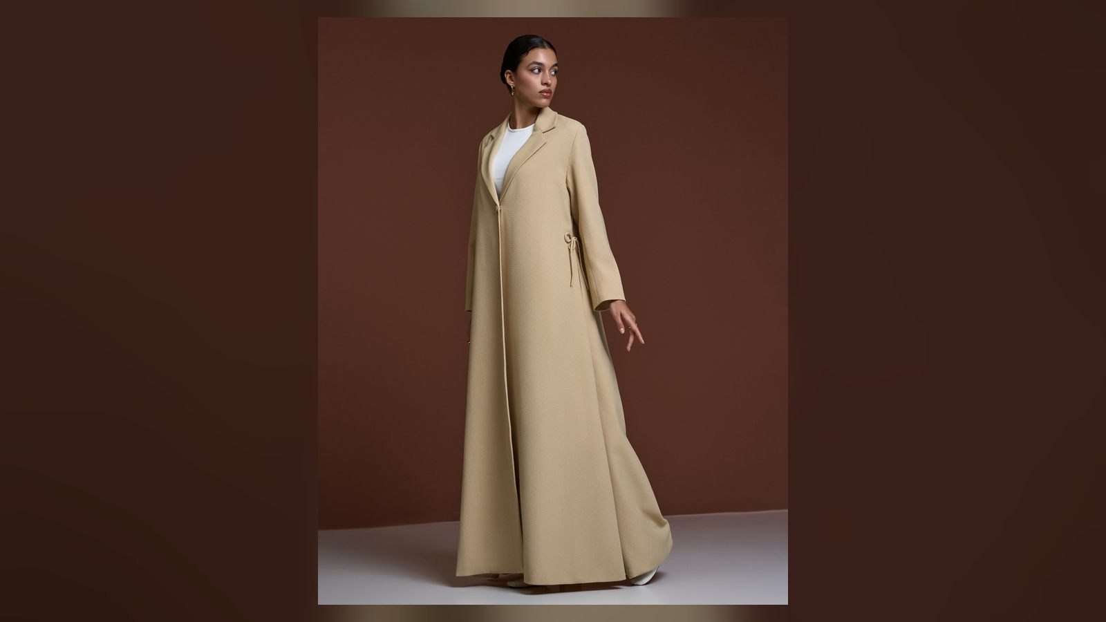
Professional fashion lighting should provide stable colour and enough detail across the garment.
Mixing daylight, venue lighting and lamps with different colour characteristics can create areas that appear warmer, cooler, greener or more magenta. Automatic camera white balance may react differently as the model moves through the frame.
In a controlled studio, the team can use consistent light sources, block unwanted ambient light and repeat the setup for every SKU. On location, changing daylight and reflected colour from walls, floors or surrounding architecture require closer monitoring.
A red wall can cast warm colour onto a white garment. Green landscaping can affect skin and pale fabrics. These reflections may be subtle on set but visible when images are placed together in a catalogue.
Exposure Changes Perceived Colour
A garment that is photographed too dark or too bright may no longer communicate its real colour or texture.
Black clothing needs enough exposure to reveal seams, folds and material without becoming washed out. White garments need highlight detail without appearing grey. Saturated colours can lose texture when individual colour channels are overexposed.
The photographer should evaluate both the overall image and important fabric areas. A visually bright fashion image is not useful if the garment’s coloured highlights contain no recoverable detail.
White Balance and Colour References
White balance establishes how neutral tones are interpreted under the chosen light.
A neutral reference or colour target photographed under the actual setup can give post-production a reliable starting point. It does not replace visual approval, but it helps maintain consistency between batches and cameras.
The reference should be captured whenever lighting changes. A target photographed in the morning does not describe a different location or a daylight setup later in the afternoon.
Camera and Lens Consistency
Different cameras and lenses may render colour and contrast differently. In a multi-camera or multi-day production, settings and processing should be coordinated.
Use a consistent camera profile, exposure method and lighting reference. If additional photographers are working simultaneously, the team should agree on the technical standard before the first garments are completed.
Consistency is especially important when one product page combines a front image, back image, detail crop and video thumbnail from different capture systems.
Calibrated Monitoring
Colour decisions should be made on a display intended and maintained for visual work.
A monitor that is extremely bright may encourage the editor to produce images that look too dark elsewhere. An uncalibrated display may add a colour cast that leads to unnecessary corrections.
Calibration does not make every customer screen identical. It provides a known working reference so the production and brand teams are not correcting the same file according to several uncontrolled displays.
Retouching Without Changing the Product
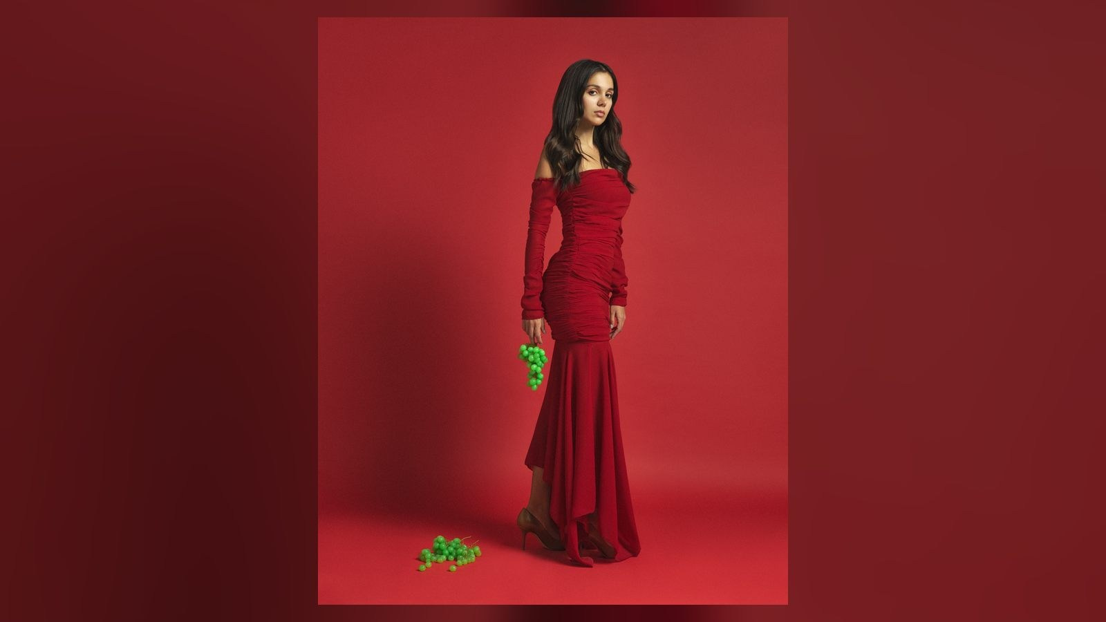
Fashion retouching should maintain colour consistency while preserving fabric texture, construction and finish.
The editor may balance small exposure differences, remove colour contamination, clean backgrounds and align colour between angles. However, aggressive saturation, contrast or smoothing can change the product.
Velvet, sequins, mesh, denim, leather and metallic textiles need different treatment. A global adjustment that improves one area may damage another.
Colour work should be applied with masks and material awareness rather than one filter across the complete garment.
Photographing Colour Variations
A collection may include the same design in several colours. Decide whether every variant will be photographed or whether approved colour conversion is appropriate.
Separate photography is usually safer when:
- The fabric texture changes between colours
- Dark and light variants reflect light differently
- Print placement varies
- Embroidery or trim changes
- The material is transparent, metallic or highly textured
- The fit differs between samples
Colour conversion may work for simple, consistent materials when the product construction is identical and a physical reference is available. The time required for accurate masking and approval should still be included in the production plan.
On-Model, Mannequin and Flat-Lay Differences
The same garment can appear different across photography formats.
On a model, fabric curves toward and away from the light. Skin, makeup and the environment can influence the overall colour balance. A mannequin may create deeper internal shadows. A flat lay can appear more even but may compress texture and volume.
If a product page combines formats, they should be compared together. The customer should not see a bright blue flat lay, a darker on-model image and a green-blue detail crop for the same SKU.
Background Colour Influences Perception
Human colour perception is affected by surrounding tones.
A neutral garment may appear warmer against blue and cooler against orange. A dark background can make the same product feel brighter than a white ecommerce page.
Clean catalogue images should be reviewed on the background used by the website. Campaign images may intentionally use coloured environments, but the garment still needs enough separation to remain understandable.
Video and Still Photography
Fashion brands increasingly produce photography and short-form video during the same shoot. The two systems must be aligned.
Video cameras, picture profiles, lighting exposure and post-production can produce a different appearance from still photography. If the assets will appear beside one another, define a shared colour reference and review representative frames.
A colour that looks correct in one exported photograph may shift after video compression or platform processing. Test the intended delivery format rather than approving only the camera files.
Ecommerce Platform Processing
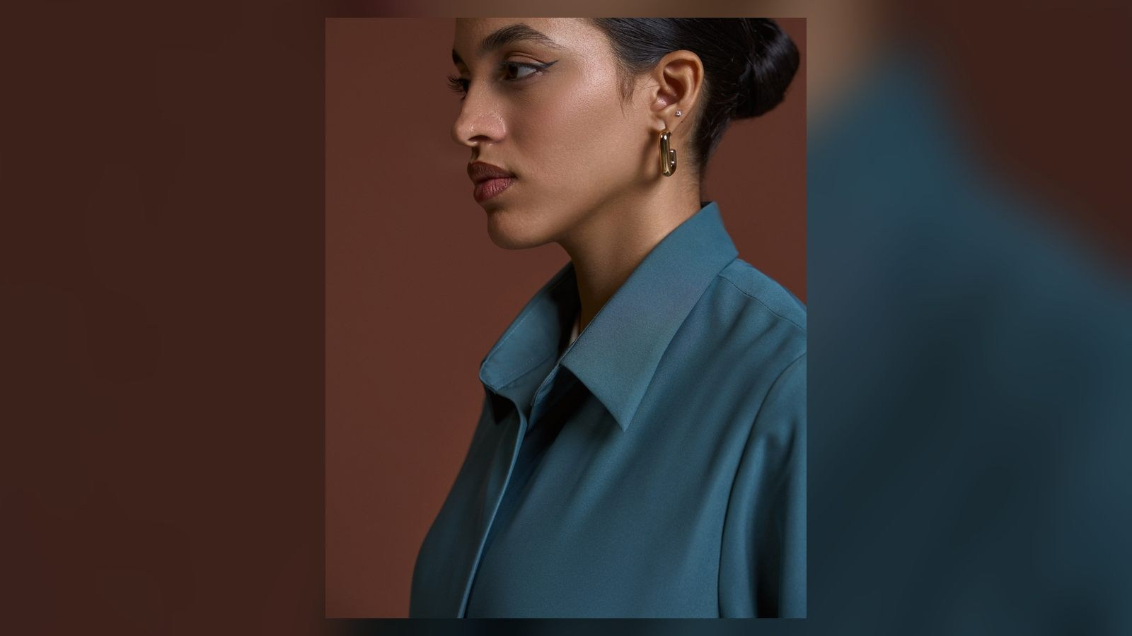
Websites and marketplaces may resize or compress uploaded images. The final appearance also depends on the colour profile embedded in the file and how the browser or app interprets it.
Deliver files in the format requested by the platform and test several representative products after upload. Do not judge the entire catalogue from one local preview.
If a platform strips metadata or creates several thumbnail versions, review both the product page and the zoomed image.
Customer Screens Cannot Be Fully Controlled
Customers use phones, laptops and monitors with different brightness, display modes and age.
Some devices increase saturation or use warm night settings. Ambient light also changes perception. No production company can guarantee identical colour on every screen.
The practical objective is a neutral, standardised master file with enough tonal detail to remain understandable across normal variations. This should be explained internally so teams do not overcorrect a reliable file based on one unusual display.
How to Approve Colour
Define one approval process and one authoritative product reference.
A useful workflow is:
- Confirm the approved physical sample
- Photograph a representative test under final lighting
- Complete base colour and exposure correction
- Review on a suitable display beside the sample
- Approve the standard before processing the full batch
- Review difficult colours and materials separately
Record decisions. If the brand requests a deliberate creative change, distinguish it from the accurate ecommerce version.
Build a Colour and SKU Matrix
For a large catalogue, create one row per SKU and record the style name, colour name, sample status, required angles, references and approval status.
This prevents missing variants and incorrect file naming. It also helps identify when the same design has different materials or trims that require separate treatment.
Use filenames that connect directly to the ecommerce system rather than informal descriptions used only on set.
Common Mistakes
Using an Unapproved Sample
Perfect photography cannot represent final stock accurately if the sample itself is wrong.
Mixing Light Sources
Different colour casts across one garment are difficult to correct naturally.
Increasing Saturation for Impact
A more vivid image may be attractive but can misrepresent the product.
Approving on Several Uncontrolled Screens
Conflicting feedback can create repeated corrections without improving accuracy.
Assuming Every Variant Can Be Recoloured
Texture, finish, print and reflections may change with the physical colour.
Ignoring Images After Upload
Platform processing can affect the final customer-facing result.
Frequently Asked Questions
Can fashion photography match a garment exactly?
A controlled workflow can create a reliable representation, but customer displays and viewing conditions vary. The source file should be verified against the approved sample.
Should every colour variation be photographed?
Separate photography is safest when materials, prints, trims or light behaviour differ. Simple variants may sometimes be created through controlled colour conversion.
Why does black clothing sometimes look grey?
Exposure, reflections, lint, fabric finish and screen brightness can all affect the result. Black should retain useful texture without becoming washed out.
Can a phone be used to approve colour?
A phone can help check typical customer viewing, but the master approval should use a known display and the physical product reference.
Does the website change image colour?
Resizing, compression, colour profiles and device rendering can influence appearance. Test final uploads on the actual product page.
Conclusion
Accurate fashion colour is created through a complete production system, not one adjustment during editing.
It begins with the correct sample and consistent preparation, continues through stable lighting, exposure and calibrated post-production, and ends with structured approval and platform testing.
When brands define one reference and one workflow, their ecommerce catalogue becomes more trustworthy, consistent and easier to maintain across new collections and production days.
Planning Fashion Ecommerce Photography in the UAE?
GSP Media provides ecommerce fashion photography, campaign production and short-form video for brands, designers and agencies in Dubai and across the UAE.
We can help build a repeatable colour and image standard for your collection, from sample planning through photography, retouching and organised delivery.


AI Content vs Traditional Photography and Video: What Should Your Brand Use?

How to Prepare Product References for AI Content Production

How Many Product Images Does an Ecommerce Product Page Need?

What Affects the Cost of Professional Live Streaming in Dubai?

How to Plan Photography and Video for a New Fashion Collection

How Product Photography Pricing Is Calculated

What Should Be Included in a Video Podcast Production Quote?


How Many Short Videos Can You Create From One Video Podcast?
Ecommerce Fashion Photography vs Campaign Photography
Product Photography vs Product Videography: What Does Your Brand Need?